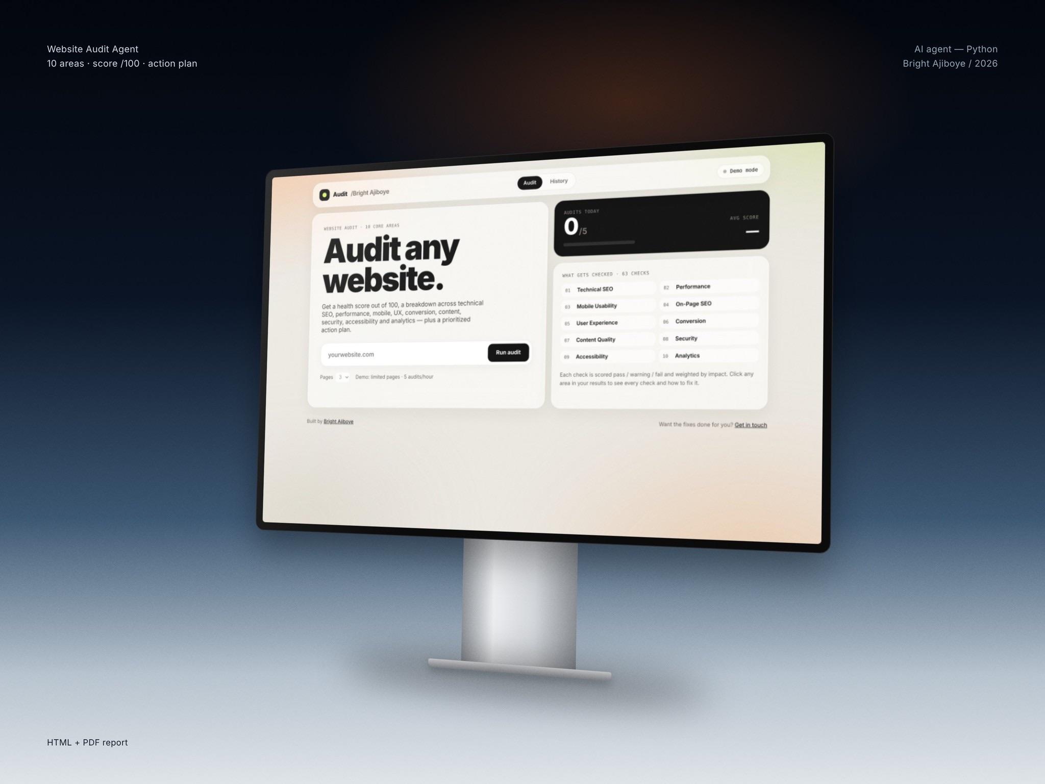
B2B SaaS, Series A
Website Conversion Audit
A page-by-page review of a live SaaS website that ends in a ranked list of fixes the team can ship.
- Industry
- B2B SaaS
- Timeline
- 2 Weeks
- Platform
- Marketing Website
- Engagement
- One-off project
Scope
- 40+
Pages audited
Every template and key page is reviewed: home, pricing, product, comparison, signup and docs entry points.
- 2 wk
Turnaround
One week of review and analysis, one week to write up, prioritize and walk the team through the findings.
- 25+
Ranked findings
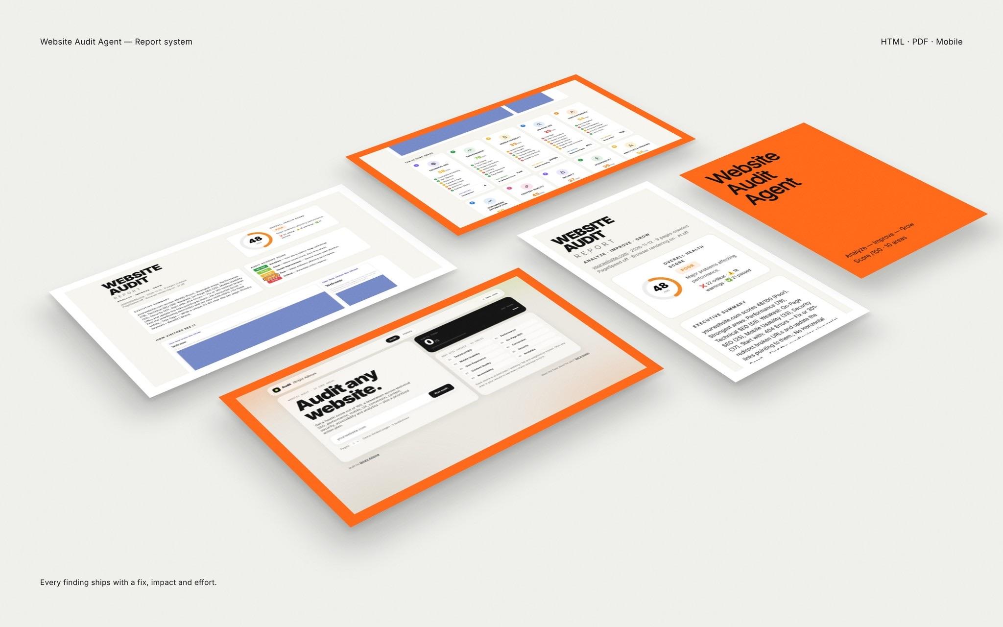
Each finding is scored by expected impact and effort, with annotated screenshots and a recommended fix.
- 4
Disciplines
Design engineering, brand design, search and project management review the same pages from their own angle.
An audit is only useful if someone can act on it on Monday. We write every finding as a change a developer could pick up, with the reason it matters and what to measure after.
Most live software companies know their website underperforms but cannot say exactly where. Traffic arrives, some of it converts, and the reasons stay vague. This engagement starts by reading the site the way a buyer does, then the way a search crawler does, then the way an engineer does. We map each page to the job it has in the funnel, check whether the message, layout and performance support that job, and note every place a visitor has to work harder than they should to take the next step.
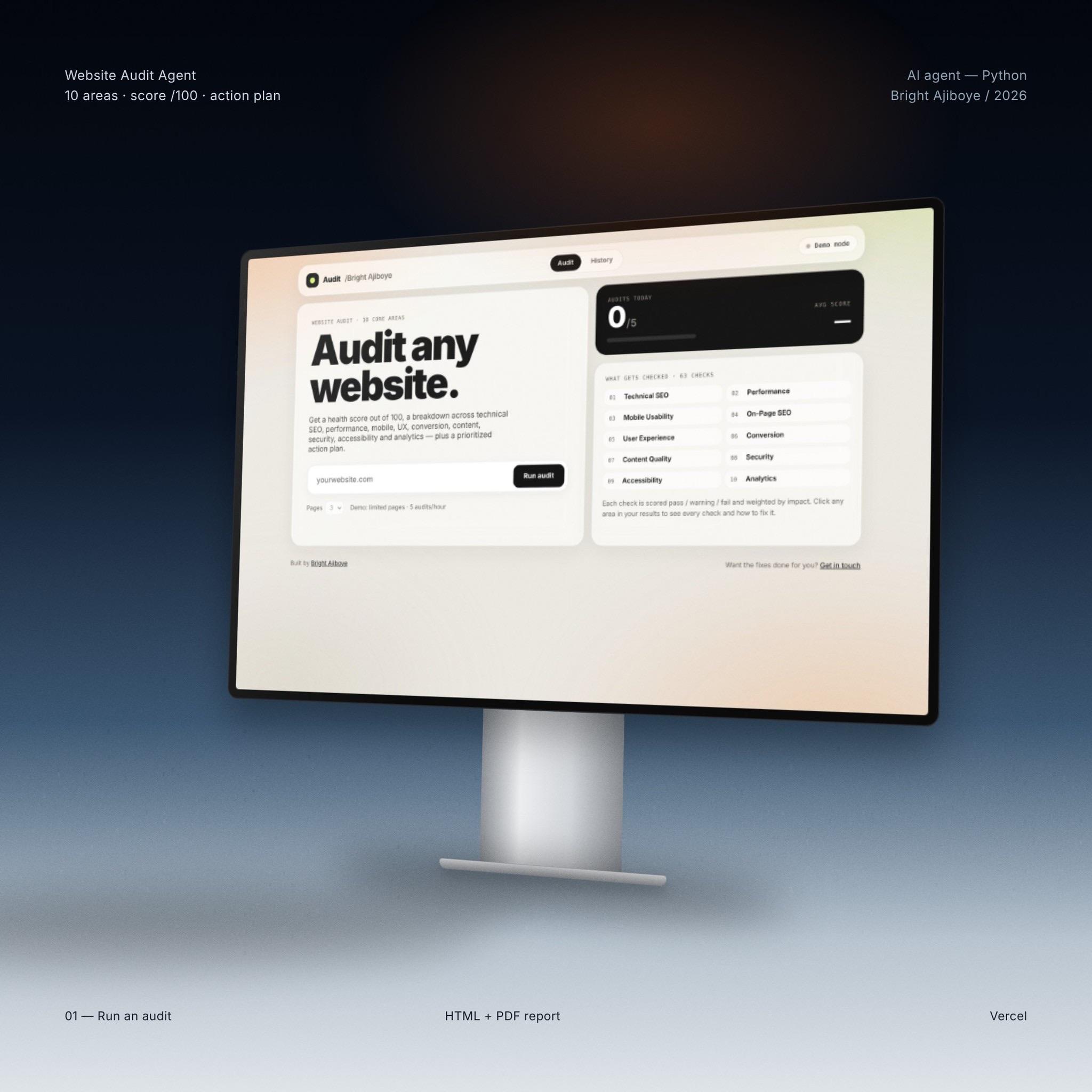
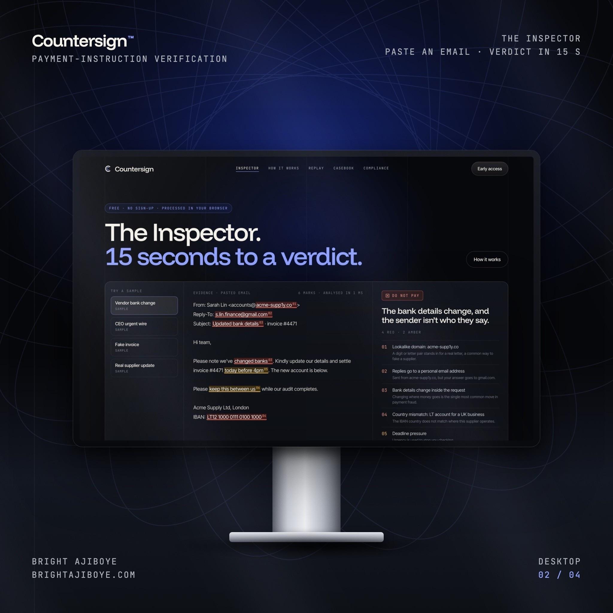
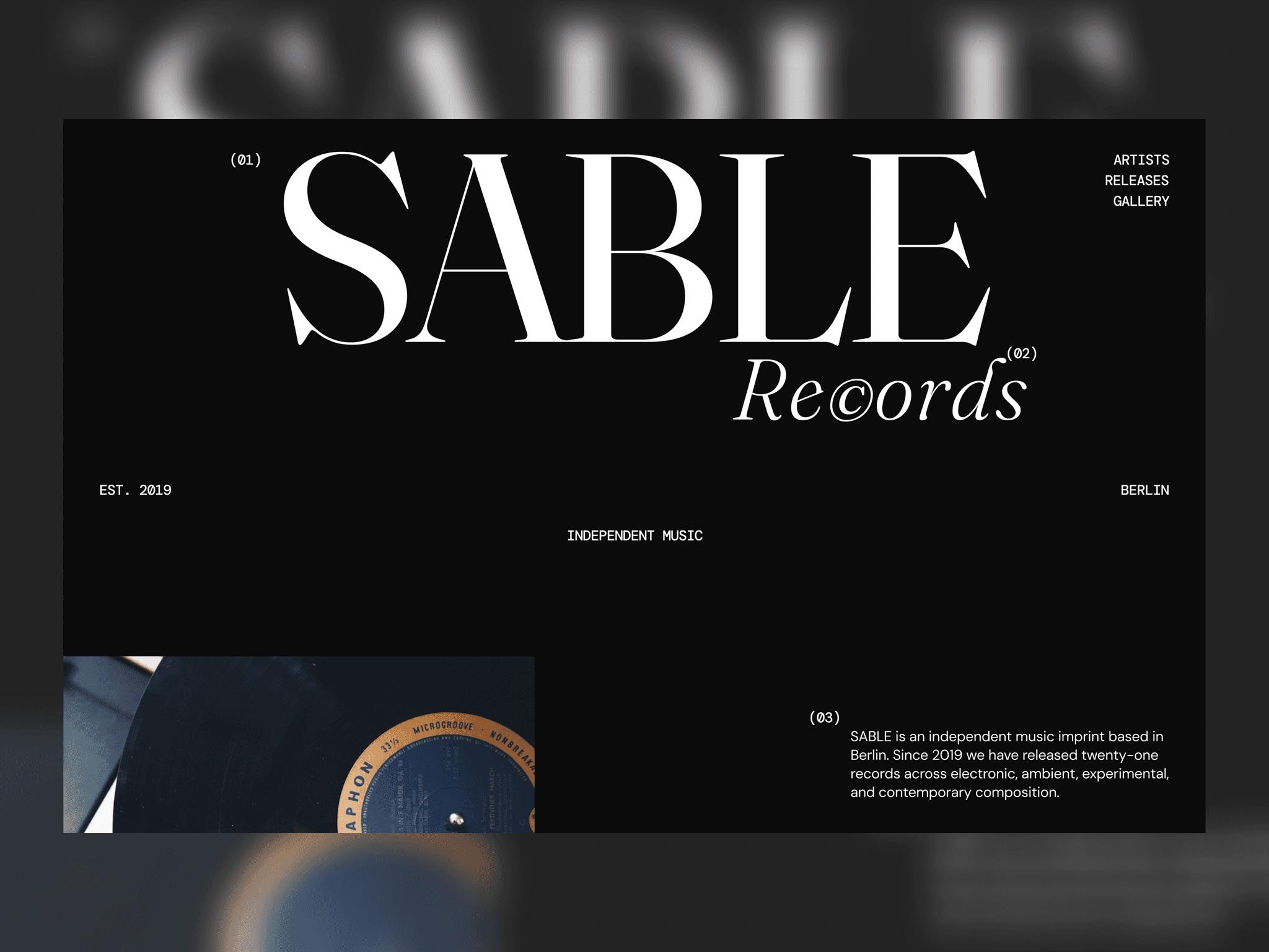
The first week is review. We walk the main journeys from first visit to signup or demo request, on desktop and mobile, and record where the page loses clarity or momentum. Alongside that we check the technical layer: load performance, layout shift, heading structure, metadata, internal linking and how the site reads to search and answer engines. Analytics and session recordings, where the client can share them, tell us which problems are common and which are edge cases. Brand designers look at consistency and hierarchy while design engineers look at what the code is actually doing, so a finding like “the hero is slow” arrives with its cause attached.
The second week is turning observations into decisions. Each finding gets a short description, an annotated screenshot, an impact and effort score, and a recommended fix written specifically enough to become a ticket. We group them into quick wins, structural changes and items that need a test before anyone commits. The deliverable is a document and a walkthrough call with the people who will do the work. Some clients take the list and ship it themselves; others ask us to implement the first batch. Either way the audit is written to stand on its own.
How we work
- Every page is judged against one question: what should a visitor do next, and does the page make that obvious? Findings that don’t answer it are left out.
- Design and code are reviewed together. A layout problem and the performance issue behind it are reported as one finding with one fix.
- Findings are ranked by impact and effort, not listed in the order we found them. The first page of the report is the shortlist.
- Recommendations are written as tickets. Each one says what to change, where, why it matters and what to measure once it ships.
The team leaves with a ranked backlog instead of a general sense that the site could be better. They know which five changes to make first, which ones need a test, and which long-standing debates the evidence has settled. Nothing in the report depends on us to carry out.
An audit is the usual starting point for a longer engagement, but it is scoped to be useful without one. The document includes the reasoning behind each recommendation so the team can apply the same thinking to pages we did not cover and to pages they build later. Where the findings point to something larger, such as unclear positioning or a signup flow that needs redesigning, we say so plainly and outline what that work would involve. The figures on this page describe a typical scope for a mid-sized SaaS marketing site; a larger site or a product audit changes the page count and the timeline, not the method.